Building Vecino Feliz's Tool-Sharing Concept Through Validated User Experience Design
Market validated: 9 interviews + 6 surveys confirmed demand.
Analyzed 4 competitors for UX patterns.
Key insight: Card sorting revealed users separate borrowing/lending mentally.
Impact: 40% to 90% task completion by redesigning navigation.
Timeline: 7 weeks, 10 users tested.
CORE ACHIEVEMENTS:
The problem & opportunity
Have you ever postponed home repairs, renovations, or DIY projects because you lacked the tools, the budget to buy them, or the time to search for them?
By contrast, your nearby neighbors often have tools they rarely use, just taking up space.
How can I facilitate safe and efficient interactions between neighbours interested in renting or lending tools?
ROLE:
End-to-end product design.
KEY COMPETENCIES:
User Research & Usability Testing | Information Architecture | Interaction Design & Prototyping | UX Writing | Strategic Product Thinking.
The journey began by validating market demand.
Inspired by Nielsen’s 2014 global study on the sharing economy, which involved 30,000 participants from 60 countries I recognized that Latin Americans were highly receptive to collaborative resource-sharing.
In Latin America:
70% of people are open to sharing if there’s an economic incentive.
73% are willing to rent or borrow products.
23% expressed specific interest in sharing tools.
Who is willing to share?
Millennials, 21-34 years old 28%
Generation X, 35-49 years old 23%
Baby Boomers, 50-64 years old 15%
With strong market demand validated, what goals should guide the product?
🔍 Facilitate local discovery
🤝 Enable trusted contact
👥 Stimulate community sharing
Tool Tribe
✅ Clear vocabulary, extensive Help section
❌ Suffers from overcrowded navigation
What about existing solutions?
In the need of more data, I performed a Competitive analysis of similar tool-sharing apps
Rent4Me
✅ Three search options (keyword, map, categories)
❌ Includes unclear icons and cluttered interfaces
Library of things
✅ Simple navigation
❌ No search engine
MyRent
✅ Combines intuitive navigation with concise design
❌ Has contrast issues with readability
And what users are saying?
I remotely interviewed 9 people and surveyed 6 more across Latin America to understand real needs.
Research uncovered two distinct archetypes and recurring themes around ease discovery, trust and local connections.
Eduardo, the neighbor who needs tools
30 years old, Millennial, single, creative professional
Needs: Access tools for one-time use, save on costs, to maintain a simple and practical home.
Frustrations: Delays in completing home projects due to a lack of tools and difficulty finding someone willing to lend them.
Represents: 28% of sharing economy market.
Antonio, the neighbour offering tools
59 years old, Baby Boomer, married, small business owner
Needs: To monetize unused tools and build connections with neighbors.
Frustrations: Tools taking up space, fear they'll get damaged, and feeling a bit lonely after the kits move out.
Represents: 15% of market.
So, Eduardo and Antonio each have very different challenges.
To ground goals and user needs, I defined two points of view (POV) representing the main user groups.
Taking both users’ needs into account, the MVP (Minimum Viable Product) included the following core features:
Eduardo needs someone to lend or rent him tools because he wants to make repairs to his home without spending money on tools he’ll only use occasionally.
Antonio needs a way to rent tools to responsible individuals because he wants to explore new sources of income and create local ties.
For the neighbour who borrows or rents
Sign up with contact and payment details.
Search and reserve available tools by keyword, location, and categories.
Manage Reservations.
Chat to connect with the neighbour offering the desired tool.
For the neighbour who offers tools
Sign up with contact and payment details.
Add or create a listing for a new tool, for lending or renting.
Manage offered tools
Chat to validate new requests.
Participants confirmed:
Personal data in the “Sign Up” category.
The "List" or "Map" views in the “Search Results” category.
The "Filters" in the “Search Options” category.
Participants modified:
"Sign Up" no longer includes "Payment" and "Receive payment" options, as they are optional.
"Categories" was isolated as an independent search option.
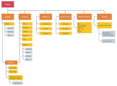
Once the MVP was defined, I moved on to structuring the app’s experience, to make sure the information architecture made sense and I ran a hybrid card-sorting activity.
Participants removed:
"Verify" and "Confirm Availability" are redundant since availability dates are already defined in the filters.
"I Need" is redundant as it corresponds to the search input field.
"Offer" as a category name, is unclear.
Based on those insights, I reworked the information architecture to better align with user expectations and mental model.
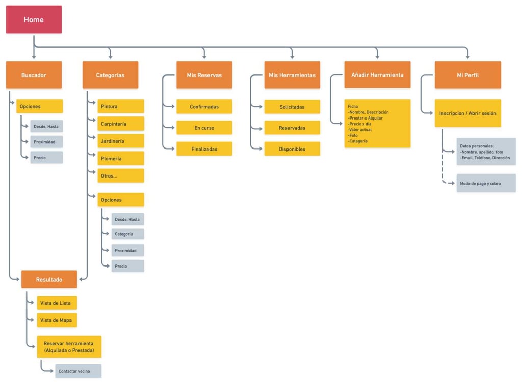
The Critical Insight:
Users think about borrowing and lending as completely separate activities.
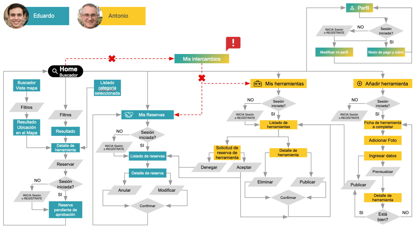
With the information architecture in place, I moved on to mapping the user flow.
In the initial version, I grouped My Bookings (Mis reservas) and My Tools (Mis herramientas) under a single section called My Exchanges (Mis intercambios).
However, later usability testing revealed that this label confused participants.
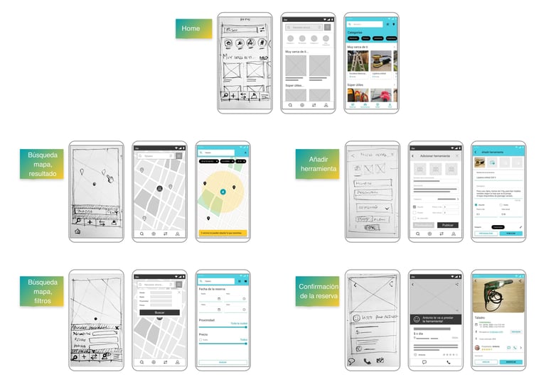
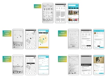
From there, I sketched low-fidelity wireframes, then moved on to digital wireframes in low resolution to be used for a remote usability test with 5 participants and test 6 flows, including reserving and managing tools, confirming and canceling reservations, and setting availability.
Round 1 Usability Testing showed 40% of users struggled with confirming or canceling reservations, 47% of tasks took extra steps, and 77% were completed.
What didn’t work
Root cause: "My Exchanges" section confused users
Unclear icons in bottom navigation.
Ambiguous labels reduced clarity.
Cluttered navigation options.
"I can see I made a reservation... but where is it? Is it in 'My Exchanges'? But that's also where my tools are... I'm confused."
Main redesign decisions to test with the high-fidelity prototype:
Separated "My Tools" and "My Bookings" for clearer navigation.
Redesigned bottom navigation for clarity, limiting its presence to top-level screens.
Excluded status "Coming Soon" and "Not Available" tools from the list.
Updated wording, for example, "Free" instead of "Borrowed".
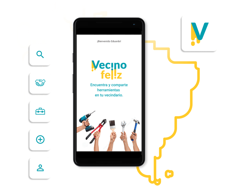
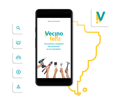
HIGH-FIDELITY & VISUAL IDENTITY
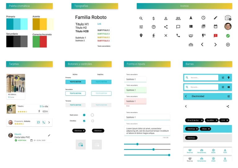
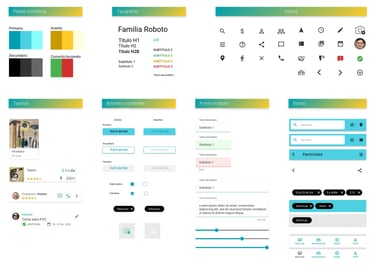
As the design evolved, I moved into high-fidelity wireframes,
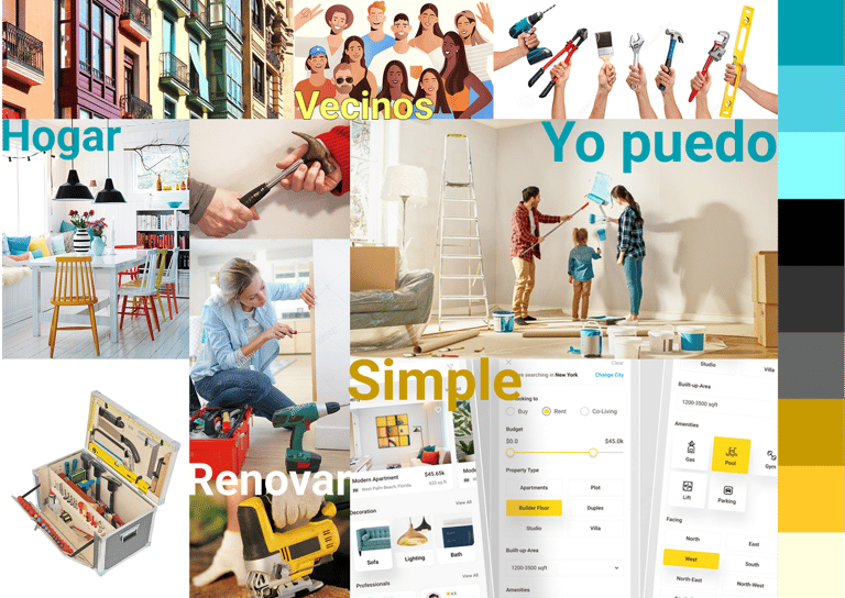
First created the core brand elements. Inspired by the moodboard, I developed a cohesive visual style with warm colors, modern typography, and a friendly, approachable tone.
Then, I built the app’s design system to ensure consistency and scalability across the product.
Finally, I designed the logo as a key asset within the overall brand identity.
🔍 Click or tap any image to view full screen
To bring the concept to life, I transformed the wireframes into an interactive prototype, where 5 new participants tested the same 6 flows as in the previous usability test.
Round 2 Usability Testing showed 90% of users succeed with confirming or canceling reservations (from previous 40%), extra steps in 47% of tasks were minimized and 93% of tasks were completed.
What I validated
Separated flows improved task completion 77% to 93%.
Map view particularly popular for location discovery.
No confusion about Spanish terminology in Round 2.
80% of users described their experience as easy or very easy
"Oh, this makes sense now. If I'm borrowing, I go to My Bookings. If I'm lending, I go to My Tools. Simple."
What Didn’t Work
Cancel Reservation task didn’t reach 100%.
Participant expected the "Cancel" button on the tool card instead of opening details.
Goals validation
🔍 Facilitate local discovery:
100% task completion on location-based search proved the discovery interface works intuitively.
🤝 Enable trusted contact:
Users can contact each other through the app and build trust over time.
👥 Stimulate community sharing:
Interface supports both borrowing and lending with users understanding the dual-sided value.
Projected Business Impact
This is a concept prototype, but it shows promising potential to benefit communities by making unused tools accessible and building neighbourhood connections.
Next steps: Launch a real-world beta—FREE with no monetization—to validate behaviour, build trust and supply, and prove the concept works.
If the beta succeeds, low-commission business models (10% on paid rentals) could be introduced, while still supporting free lending, user verification, and damage protection. Enable sharing, don’t block it.
What I learned
Card sorting reveals mental models fast. Five participants showed "My Exchanges" wouldn't work—users separate borrowing from lending mentally.
One insight drives major improvements. Fixing navigation: 77% → 93% completion. Not every problem needs a redesign.
Data shows WHAT failed, users show WHY. Small samples (5 per round) reveal clear patterns when you listen.
What I Would Do Differently
Expand testing to 8-10 participants for higher confidence and edge cases.
Test dual-sided flows—23% who both borrow AND lend need seamless role switching.
Run neighborhood beta before scaling—real neighbors teach more than scattered users.
Explore trust features earlier—damage protection and verification needed upfront research.